
Back in the early and mid-nineties, websites were a new thing. Not a lot of people knew about them, and they didn’t serve much of a purpose. Over the years, websites have grown and evolved to become one of the most important marketing assets any company could have. They are versatile, informative and most importantly, all about you and your company.
Most websites nowadays are attractive, modern and user-friendly. Their design and functionality have also improved drastically since the early years. When we look at or evaluate a website, we look at its ease of use, proper use of colour and animation, its structure, its design and relevancy to the topic/field, and its integration with social media. Website design has become both a technical skill and an art, and it’s a joy to explore what new designs and functionalities different websites have to offer.
However, once in a while, you surf the web and find one of these old websites that seem to be trapped in time. Some are too basic, others too cluttered and every so often, you just find a website that’ll just shock you. So, what are some of the sites we’ve seen that have shocked us? We’ll give you our top 3 list. Please note that if you are the owner of these sites…we don’t mean to offend! We all had to start somewhere, right?
1. Ling’s Cars
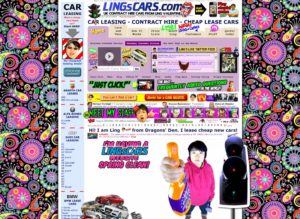 Click on the link, and you arrive at a page with an insane amount of content! Your entire browser becomes cluttered with so much text and graphics that you can’t even focus on one particular area of the site at one time. There’s a pulsating Mercedes somewhere on the page, and then you notice a hen walking across the screen. The fonts differ in every area of the website, and you see cars splattered across the screen, sometimes in piles. Keep scrolling, and there’s more cars and an Asian face that keeps popping up and swivelling here and there. At the bottom of the page, there’s more of these faces and arrows pointing to them, apparently leading us to believe that this woman’s face belongs to Ling Valentine, the owner and name of the website.
Just by looking at the site, it’s obviously a very, very busy website on an epic scale. I just can’t focus anywhere on the site without being distracted by something else. You can obviously get the sense that the site has something to do with cars owned by Ling. That’s pretty clear. In fact, you can get all the information you’re looking for on the website, if you know where to look. There’s also a lot of unnecessary content on there…try finding the page with newspaper clippings and writing all over, talking about her pet nuclear rocket missile!
Interesting fact…Ling Valentine is a very successful businesswoman in the UK and has appeared on Dragon’s Den. Maybe she’s got a point…go completely against the norm and stand out in order to be noticed!
But back to our analysis…we would never make a website like this. It’s too cluttered and busy, and we like working with clean, simple, and elegant designs that shock people…in a positive way!
2. Accept Jesus, Forever Forgiven!
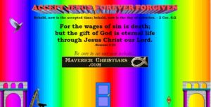 As soon you open this site, your retinas are attacked by a flashing wave of rainbow colours. What’s that floating around the colourful background? A dove flapping its wings! There’s some text and a quote from the Bible, and then at the bottom of the page, a cat runs across the page…across some pillars, a ladder, a door, and a construction sign. What does this even mean?
Obviously, this website is far from the best website I’ve seen; it’s one of the worst in my book! I feel it might as well have a warning sign somewhere saying “Caution: this site may cause epileptic seizures or convulsions” because the rainbow wave is quite distracting.
From an analytical standpoint, apart from the clear design flaws, this website does not have a purpose. There’s a quote from the Bible, and it seems to have a religious theme…but what is it trying to tell the audience? There’s not enough information for it to be a useful website. Instead, it’s cluttered with unnecessary objects, images and animations that make the site an eyesore.
For good web design, you want to be able to understand what the website is about, and all content should be located in easily-found and easily-read locations.
3. Penny Juice
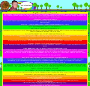 Okay, so this website is pretty straightforward. You reach the homepage and there’s few questions that you’ll probably want answered. Who is Penny Juice? What is Penny Juice? Where is Penny Juice? Got Juice? And Penny’s E-mail. At least it’s easy to understand. Let’s click on the first question.
Whoa! You arrive at a new page with a baby and a coin. But what’s most shocking is the unending text in Times New Roman font, all capitalized, broken apart into sections by different background colours. First of all, there’s too much text. Secondly, the colours are distracting.
Checking out the other pages, they’re all very similar. It’s an older website from 2002, but still…it was never updated to modern times! We decided to add this one in as one of our websites in most need of improvement because even though it’s old, we still find a lot of websites that suffer from too much text and misuse of multiple colours. When you’re designing a website, you really want to place your text where it is easily read, and use colours wisely so that they complement the text, the design, and functionality.
Do you have any sites on your worst website list? Please comment on this post to share your thoughts what sites you think are the worst you’ve seen!


There’s a website that’s called the Worst Website Ever (http://www.theworldsworstwebsiteever.com/). Even so I don’t think it’s the worst. You should check out this one http://www.arngren.net/
Thanks for sharing your thoughts, Jim! The Argngren site is pretty jam-packed with content!
All those websites are really horrible… Why do people make such websites? It is very easy to get a simple WordPress template, for example, from http://www.templatemonster.com/wordpress-themes.php resource and use it instead of such ugly things
Thank you for your comments, Jess! With the number of website templates out there…we agree in that it’s better to invest in a simple, cheap template if you have trouble coding.
Yeah I feel like they make those websites as a joke. They’re so outdated. I do WordPress websites too and I find a lot of business owners who are old-school don’t really care about websites, so the old designs never change for them and never evolved with the times.
I find a lot of website design companies have pretty crappy websites too. I mean, I googled some web design or development businesses in the tricities and some were pretty old and ugly. I also saw one who asked another design company to do their web design for them, which is kinda funny. I like your site, it’s new and cool looking. Everythings easy to find.
Thanks, Corey! Appreciate it.
I have seen worst ones then these but thay are realy bad
Thanks for your comment, Glenda! Feel free to share some of the links of the bad websites you’ve seen!