In academia, the quest for deeper knowledge is never-ending. Researchers perform experiments and studies to try and explain phenomena that haven’t yet been explained or are still a mystery to the common world, and when they obtain results, they share them in the form of reports, journal articles, theses, and more.
Although research can be fascinating and the results both shocking and inspiring, it is important to not only express these results in words, but also in pictures. And as the saying goes, “a picture is worth a thousand words.” A research article can be written amazingly well, but when it comes time for publication, you don’t want just the written content to be captivating and detailed, but also the images and data presented in your report.
To promote a better understanding and appreciation of a researcher’s work, having an appealing scientific illustration is crucial to the conveying of a theory or result to the targeted audience. Let’s pretend that you just discovered the lytic cycle, one of the two types of viral reproduction. You wrote an excellent article and would like to have an illustration of the lytic cycle. You contemplate two options: (1) drawing it yourself, even though you know you’re not the greatest at drawing and it will take up a lot of your time; or (2) asking a professional scientific illustrator to help draw this cycle in detail.
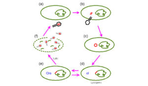
Figure 1. Simple schematic of the lytic cycle. Looks hand-drawn and unprofessional.
Let’s start with Option 1. You spend a lot of time drawing out the lytic cycle, and you end up with something like Figure 1. It’s simple, it’s minimally labelled and you think you’ve done a great job. But here’s the problem…will other people who aren’t as familiar as you with the content understand the picture as quickly as you do? Probably not. As a researcher and author of the article, you are obviously more familiar with the content of the article and the research you’re doing. As a result, I find that with a lot of articles I read, the images and pictures presented are usually quite difficult to understand without reading the entire article itself. And sometimes even after I’ve read the article, I question the clarity of the images and diagrams presented in the paper or sometimes, even in a book. I’ve seen crude hand-drawings, black and white images plus over-simplified diagrams that lose their meaning.
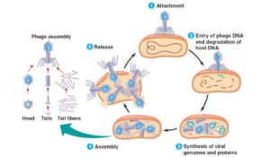
Figure 2. A professionally-drawn schematic of the lytic cycle that will be presentable in printed media.
So that brings me to Option 2. If you do draw something yourself, ask other people to look at it, both from the academic world and non-academic world. Ask for more opinions and critiques, and if the drawing is not up to the majority’s standards, then you should consider hiring a professional. Let’s take a look at the lytic cycle diagram drawn by a professional graphic designer, seen in Figure 2. As you can see, the image is more captivating, clearer, easier to navigate and simple enough for everyone to understand what’s going on. Graphic designers are able to breathe visual life into your ideas and words, and their creativity helps propel your article or paper to the next level if you’re not already there.
So, when you’re working on a scientific publication, ask yourself this: what image do you want your work to be associated with? If you’re not capable or don’t have the time to spend drawing a detailed scientific illustration, we would recommend you hire a professional to do the job for you. It saves you time, and if you find a graphic artist that understands your research, that’s even better.
Luckily, CryoDragon offers those services! So if you are look for help with scientific illustrations, our team at CryoDragon has a strong academic background in the sciences and can help you create or modify your results and data into a professional graphic. Contact us now to inquire about scientific illustrations!